Monday, 12 December 2016

Helvetica

Today's lecture and seminar was focussed around Helvetica. We looked at the Helvetica documentary about typography and graphic design. The documentary was released to mark the 50th anniversary of the typefaces creation, it aims to show how Helvetica was created and explores modernism and postmodernism.

We also looked briefly at David Carson, an American graphic designer and art director that is best known for his use of experimental typography. I have researched David Carson before and really love his typography work, I could consider using it as inspiration for future projects.

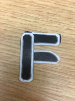
The seminar was about using existing typography to create a new one, and exploring different shapes and letter forms that create words and new shapes that look interesting and personalised. I really enjoyed this task and I am really happy with the outcome.


Typography created using existing

Thursday, 8 December 2016

Giraffe

Giraffe from Maria Lynam on Vimeo.

Created using Adobe Illustrator and After Effects 

Monday, 5 December 2016

Postmodernism

Order and Chaos - postmodernism and exploring deconstruction

Postmodernism is a general term that applies to art, music and literature it embraces ideas, repetition, challenges the view and asks the viewer to ask questions in and about life.

Christopher Cox / 2008
The poster mixes high and low art together to combine into one image: popular cultural exploration combined with 'proper' art creates a new collaged image that features hand drawn elements and looks highly political. All these features on the poster make it postmodern, it is making the statement that modernism didn't save us which is considered a typical viewpoint of postmodern art.

Jeff Koons / 1988 / 'Michael Jackson and Bubbles'
Koons is an American artist known for working with popular culture subjects, he creates art that is considered poor and is purposefully 'tacky' which is seen to be postmodern. He created this piece of art using popular culture elevated the piece to a 'sculpture' because of its size and its featured in a gallery.


Today we looked at two types of postmodern design: vernacular and self-reference.

Vernacular Design:
  • A style or aesthetic that is associated to a narrative or particular moment, location or group of people
  • Subjectivity and not being limited to one style, allowing subcultural style to emerge
  • Signage, typographical features can all be examples of vernacular design
Self-Reference
  • About looking inward as a designer, thinking about the practice of design and making it apparent in the ACTUAL design itself
Representation and Reality
Jean Baudrillard was a French sociologist, philosopher, theorist and photographer, he wrote the book 'Simulacra and Simulation' which introduces the idea that the principle of the 'real' is interrupted by the changing of signs. It expressed a meaning that is around us and in this situation people become attached by personal events, they can relate to them, they become indifferent and people can't distinguish between appearance and reality. When we are surrounded by digital signs, it becomes overwhelming and we become in a state of apathy.

David Hockney / 1986 / 'Pearblossom Highway'
Hockney has created this image using layers of the same photography to create a new collaged image. He explores the nature of the sign and communicates how the whole page is a sign. The message isn't clear, but chaotic


There are three ways to use the word deconstruction:
  1. A trendy alternative to analysis or interpretation
  2. A visual style in art, architecture, fashion and graphic design
  3. A way of reading text which aims to reveal its internal contradictions
'Deconstruction is not a style or attitude but rather a mode of questioning through and about the technologies, formal devices, social institutions and founding metaphors of representations' - Ellen Lupton

Thursday, 1 December 2016

Physical Typography

Physical Type

Physical Studio

Today's session was about still life drawing and using the objects on each table to draw from. The first table being Physical Type, I chose to focus on the 'R' in the left hand corner to practice my drawing skills from this angle and seeing if I was able to get the right proportion, angle and shading right.

Typography focus with oil paste
Table two was Objects and I took the oppurtinmity to continue to look at typography instead of looking at the object compleyely I took out smaller details. I chose to use oil pastels for the rest of the drawings as I really enjoy working with them and love the marks they produce. I always like to get colour into my work and feel it works best when using oil pastels.


The third table was 'Life's A Box' which were a stack of boxes featuring the IKEA logo (which I took to drawing with the oil pastels again). I found that drawing the boxes was quite hard, getting the right angles and shape of the box was difficult to produce.


Seminar - Essay

Seminar

Looking at the work produced last week we looking at writing the introduction to the essay and how to start it. I have chosen to look at women in gaming as a subculture for my question, I think that by doing something different to the sense of place project will make it more interesting than another focus on Britpop/90's. I am going to take some time gathering research (i.e. Books, Articles, Magazines, Online posts) that is going to help write the essay and begin the introduction. I will be looking at Dick Hebdige and Judith Butler as theorists and explore them further to help with define a gender and also look at gender in the gaming 'world'. By researching this and gathering the right information I should find the essay easier to plan and write the essay.

Monday, 28 November 2016

Design & Emotion


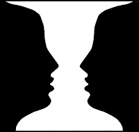
Today's lecture was about emotional engagement and meaningful communication, presented by Tracy Lannon. We looked at how engaging in different types of information would help us create designs with meaning and have some purpose to others. Throughout the presentation we looked at image illusions and how others view them differently. Illusions are created using certain angles, patterns and colours to present an image that the eye cannot understand, we as humans have to filter things down to make sense of happenings. Our expectations dictate our emotional attachment: we look for the same kind of things, preparing us for what we will see next time and what we want to take notice of e.g. The image either shows a white vase or two faces looking directly at each other, it is known that most people look at the faces first because they are something we see in everyday life and there is more focus than a vase.

Visual Stimulation:
All the information we receive is upside down, our brain flips the image and sends it to another part that best fits to understand what it is we are looking at. The retina in our eye is made up of two cells: the cone cells which only see black and white and the rod cells that see colours. We looked at two tests, the first: draw a cross and a dot on separate sides of a piece of paper, cover one eye and move the paper in our vision from side to side - when the dot or cross were out of our vision the cells were not able to work.


The second test was to look at the circles on the left hand side and pick out the numbers in each shape. With all the different dots and colours involved in the images it shows that colour blind people would not be able to understand what the number is inside the shape.


Thursday, 24 November 2016

Illustrator


Grid pattern for number 37
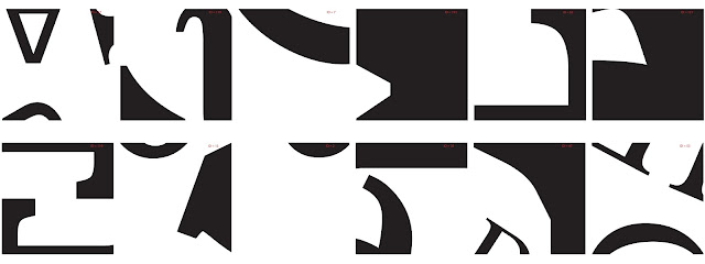
Exploring Adobe Illustrator and linking it with typography. The workshop was focussed around visual games within creative practice and particularly looking on the 'Morpholo' tile game designed by Thieri Foulc in 1985. Taking inspiration from this, the task was to focus on basic pen tool skills and the manipulation of typographic letters. I really enjoyed this task after understanding how it works and how to get each of the shapes or letters in the correct place, corresponding to the numbers for each tile.


Before beginning any digital based work I drew out and practiced some different types of fonts by hand, looking at close details that could be used to create alternate shapes for the tiles. I then took these skills to apply to the next text, developing the tiles - choosing 12 random numbers and figuring out how the number corresponds to the tile pattern:

I continued this for all 12 of the numbers and sketched out how they would look digitally.


Moving into Illustrator I then began to make to tiles using different letters and fonts to fill the black spaces. I really like the final outcome of them, they look abstract and unique.

Seminar - Jonathan Lindley


The seminar was focussed on Branding and Anti-Branding.

The task was to chose a brand we disliked and re-brand it.
I don't particularly 'hate' Covergirl but I know they use animals to test their products. I changed the tagline from 'Easy, Breezy, Beautiful...' to something that would catch the audience's eye and make them think about what brands they are buying and how they treat animals.


Module Assessment

(a) Concept Development
Successful exploration of a problem or theme demonstrated through the development and documentation of appropriate creative concepts and alternatives

(b) Aesthetics and Language
Creative decisions are made in response to thematic projects and are based on appropriate aesthetic criteria. The ability to discuss these in relation to the work produced and other diverse sources is demonstrated. 

(c) Technical Response
Appropriate technologies are selected in response to thematic projects. The ability to discuss these in relation to the production of the work is demonstrated. 

(d) Integration and Synthesis
Awareness of the need to reconcile conceptual/critical issues with the contexts of genre and audience is demonstrated

Monday, 21 November 2016

Seminar - Semiotic Analysis

Semiotic analysis in Advertising

Semiotics calls attention to the formal structure of signification; of meaning-making in a culture.

The task was to watch Christmas adverts and what messages they are communicating in each example. All of the adverts communicate the message about 'family' and coming together at a special time of the year, Christmas. It's about value and what people value - their families. The songs that pair with each advert connote love and families, about being together which are all relevant for the images shown in the adverts.

Christmas Adverts:
John Lewis - Buster the Boxer
M&S - Mrs Claus
Sainsburys - World War 1
Goggle Box - Animation about M&S Advert
John Lewis - Man on the Moon

Meaning and Message

Introducing Semiotics

Today's lecture was an introduction to semiotics and how they are used in Graphic Design. We looked at what semiotics actually were:
  • Theories that explore how the system of signs work to make a meaning
  • They represent ideas and create meanings for things such as words or images
  • It is how one thing can be used for something else
  • They make sense of the visual world
  • They communicate to the viewer visually and verbally
 All good designers are semioticians and understanding semiotics can help up communicate messages effectively. We also explored why we should understand semiotics and how they work:
  • How words and images work together
  • Shows how visual communication works
  • Design choices affect and transform the message
  • How text and image can be manipulated to benefit the messages
Semiotics can be seen as signs, which can also be seen as multiple different things:
  • Spoken or written language
  • Images
  • Objects
  • Gestures
  • Codes
  • Symbols
  • Sounds
  • Pictures
Signs can also have an emotional impact on the viewer, they can mean different things to different people dependant on their cultural experience, their differences and expectations. With different types of semiotics such as signs there are semiotics for colour which is a way in which colour is expressed and with certain information that make the viewer understand the message or feel a certain emotion - this is also culturally conditioned for each individual. Commercial world takes advantage of our ability to associate colours with meaning e.g. Red can connote passion, love and lust.

'Languages differ by differentiating differently - John Passmore

Charles Sanders Peirce says that there are three categories of signs:
  • Symbol - No logical connection between the symbol and the thing it is symbolising
  • Icon - Resembles the sign, there is a likeness
  • Index - A direct link between the sign and the thing it is representing, there is a factual connection
There are also such things as creative semiotics meaning that to understand the semiotic means you can play with how the words and images communicate with the viewer, they enable us to explain why and how clever use of text and image 'work' together e.g. Anthony Burrill 'Oil & Water Don't Mix'

Anchorage and Relay (Roland Barthes)
Text which anchors or constrains how the image is read. The reader is directed by 'how the signifier or image is read'it  clarifies or 'anchors' the meanings through visual clues. Where the image is complex, it helps to underline a relationship between the text and image e.g. advert, map, narrated documentary. The words and images tell a story equally - they stand in a relationship.

Thursday, 17 November 2016

Hunger Games Trailer

Hunger Games Trailer from Maria Lynam on Vimeo.

Created using Adobe Photoshop and After Effects. Based on the novel, 'The Hunger Games' by Suzanne Collins

Seminar - Essay

Looking at some possible questions for the essay. I am planning on writing one about subcultures as I find this the most interesting question so I have written down some ideas and done some research that could help answer them:

Two possible questions I am considering:

1.       Discuss the effect of women within the ‘gaming world’ as a subculture on graphic designers

2.       Discuss the effect of Britpop subcultures on graphic designers

Definitions:

1.       I want to explore women in gaming and how they are represented and viewed by others as a subculture. The gaming industry specifically use men as a target audience as appose to women – this is something that I will be researching further and looking into more detail. I also want to find out why this is current and what it is about the ‘gaming world’ that doesn’t ‘accept’ women

2.       Britpop is something I’ve recently become interested in – look at fashion and type of music it was e.g. indie-rock and why it has recently become so popular. Maybe compare to the era previous e.g. punk

Relevant links that could help for Question 2:


K IS FOR KINGS OF COOL BRITANNIA

Whether it was Brett Anderson from Suede posing in front of Blighty’s flag on the cover of Select magazine or Noel Gallagher wielding his patriotic guitar before a crowd of thousands, the UK flag was the unofficial badge of Britpop. It was this sense of national pride that helped popularise the genre, where lads singing about binmen and supermarkets brightened up the mundanity of everyday life. While the acerbic rivalry between Blur and Oasis may be the most abiding memory of the 90s subculture, its style legacy – shaggy hair, parkas and a sneery attitude – shouldn’t be forgotten. Think Mods, but the kind who’d ruck at a football match.


Something called ‘Lad culture’ was a British subculture initially associated with the Britpop movement. The image of the “lad” was that of a generally middle class figure exposing attitudes typically attributed to the working class. The subculture involves young men assuming an anti-intellectual position, shunning sensitivity in favour of drinking, violence and sexism.

Monday, 14 November 2016

Seminar - Typography

The seminar was about creating our own typography inspired by Joseph Albers. He created the typeface, 'Stencil' in 1926 with the aim of creating a simple and easy to read and use typeface, it is based on geometric forms.
The task was to create the modern day alphabet using the typeface, here are some examples:


Type

Typeface
 'a particular design of type'

Font
 'A font is the combination of typeface and other qualities, such as size, pitch, and spacing.'

The lecture today was about typography and exploring different types of type and how they might be used or have been created. Looking specifically at Jan Tschichold's book "The New Typography" published in 1928, a book that shows striking composistions and tells the viewer how the pages work with type and images together. The book is organised around the following principles:
  • Asymmetric balance of elements
  • Utalisation of white space
  • Sans serif typography
  • Advocated lower case letters
  • Supported the typo-photo approach
  • Content was designed by the hierarchy
"Universal" typeface
Herbert Bayer was an Austrian and American graphic designer and last living member of the Bauhaus school. He created "Universal" in 1925, a typeface created by hand with the elimination of capital letters and a stronger focus on the geometrical elements of the type. Bayer created this typeface specifically so that the type was easy to read, legible, cheap to produce and had a simple layout all elements that made the type easier and cheaper to print from machines. "Universal" featured all these elements: uniform thickness, perfect circles and lines all measured which are things Bauhaus embodied.


I learnt something new today in the lecture, kinetic type. It appears everywhere today as type that moves with simple animations. It offers the reader a different way of looking at the type and shows how it can expand, shrink and morph on the page in front of you to keep you interested. Kinetic type appears in an order and we usually see them on TV adverts, blogs and landing pages.

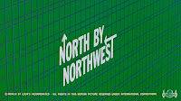
Screen grab of title sequence
Saul Bass was an American graphic designer and Academy Award-winning filmmaker who became known for using the new kinetic typography in his work. An example of this would be from the film, "North by Northwest." Bass showed his first proper use of kinetic type in the opening titles of the film. The type is modern, clean, minimal and the grid shows a reoccurring theme with lots of interetsing lines and points that cross over each other which mimics scenes in the film about people meeting and crossing paths.

Lastly, we looked at conceptual type, there is no clear cut definition for this type but Peter Bil'ak (Slovakian graphic designer) said 'Before the typeface is executed, it is not a typeface, it is simply an idea."

Reference:
Image of "Universal" retrieved from http://www.widewalls.ch/bauhaus-typography/herbert-bayer/

Screengrab from trailer retrieved from https://www.youtube.com/watch?v=KVUnUmPV33c

Thursday, 10 November 2016

Experimental Drawing

The process and production for today was about exploring a sense of place through drawing our surroundings, places like the studio, outside the studio and the area that we work in. I looked at different angles and how to draw from different view points, focusing on detail in some cases. I preferred using oil pastels today rather than pencil or pen, I found them easy to work with and created block colours and shading in some areas to make the drawing as realistic as possible.


Seminar - Referencing

Today's seminar we looked at how to reference properly using APA 6th Referencing. I learnt why we reference things and how to use specific ways of referencing so that all my work is considered my own.

In-text citations can be broken down: summarising & paraphrasing and "quotations"

Directly "quoting" someones exact work and explaining someone elses idea, theory, concept, statistics IN YOUR OWN WORDS is considered summarising or paraphrasing.

Direct quotations can either be small or large quotes. The small quotes tend to be 40 words or less and the larger 40 words or more. Longer quotes have to be indented in the essay so that the viewer knows that this isn't your work.

Examples of how they would be laid out in the reference list at the end of the essay:

Book: Kadolph S., J. (2010). Textiles (11th ed). London: Pearson.
Website : Sustaiable materials. (2015). Textiles. Retrived from http://www.sustainablematerials.org.uk/resources/textiles.html.
Journal : Turney, J. (2014) A sweater to die for: Fair isle and fair play in the killing. Textile: THe Journey of Cloth and Culture, 12(1) 18-33

Introduction to Phase 2

Introduction to Phase 2 of the brief.

I was introduced to phase 2 of the brief, A sense of place {2: place-making}. Using my primary and secondary research from my sketcbook I am thinking of focusing the proposal on one of three choices: distance, wayfinding or crowding in places (specifically looking at how the people and crowds affect the sense of place). I am leaning more towards distance as I feel this is a word that I have focused on more in my sketchbook than any other (or tried too).

Friday, 28 October 2016

Creative Exchange Week

Creative Exchange Week

Wednesday
D&AD winner Jamie Kirk put together a series of mini workshops aimed to introduce us to problem-solving techniques. I found this helpful as we linked it to our everyday frustrations to see how we could apply the problem solving within our work. We were asked to write down words to describe ourselves and focus specifically on one word also looking at how this could help us within our briefs - i.e. creative, I used this word to describe my current work and everyday life.

Friday
Icons - we created our own stories using icons. I really enjoyed this workshop, being creative and found that using icons was a good way to communicate to viewers other than using words or other images. I would like to explore this is the future and maybe create my own icons that could be used in the future.

Thursday, 20 October 2016

Photoshop

Process and Production : Photoshop

Today was about developing Photoshop skills and learning how to mask and overlay images to create different montages. I took an image taken in the first week (portrait of me) and used photoshop to make it appear on another background. I took the image (JPG File) and opened it into Photoshop. I created a duplicate layer of this so that it is easier to cut out the image and mask. I used chroma key to cut myself out from the background (green screen) and added a solid block colour to the background as a temporary. Choosing from a variety of background pictures I decided to keep within the theme of warm browns and cream colours so that the image would look more realistic by playing with the hue and saturation and levels of both the image and background. 
I really enjoy working on Photoshop and developing skills, I will continue this practice in my own time and whenever necessary so that I become quicker and create better looking pieces of work. 

 
A screen grab of the layers used in Photoshop to create the image below.


Seminar - Creative Ideas

Today was related to the essay coming up. We were practicing how to keep our sentences concise and straight to the point to avoid taking up word count for the real essay. I enjoyed this excercise but struggled in some areas...

  1. A bear. A char.
  2. A fluffy bear, a chair.
  3. A fluffy bear, a dirty chair.
  4. A fluffy bored bear, a dirty chair.
  5. A fluffly bored bear walks into the house after smashing up the dirty chair.
  6. A fluffy bored bear walks into the house after seeing his ex with a bigger bear. He smashed the chair up in anger.
I found this exercise helpful as I sometimes struggle to get straight to the point when essay writing, with more practice I think my essay's will become much more concise. 

I researched a book : Goths, Gamers and Grrrls : Deviance and Youth Subcultures. I am going to use this to help explore question one from the brief given. I am planning on focussing on Gaming and how women are not considered to 'play games' or 'game' at all. Looking at how this has changed over a period of time, up until today.

  1. A bowl of cherries and cream.
  2. A bowl of luscious cherries and cream.
  3. A bowl of luscious cherries and whipped cream.
  4. A bowl of luscious glossy cherries and fluffy whipped cream.
  5. A bowl of luscious glossy cherries sit in the warm sun and soft melted whipped cream.
  6. A bowl of luscious glossy cherries cover the ground beneath them, the melted whipped cream coats the dog's fur.
This is another example (made up) just as practice. 

A Sense of Place : Text & Image

Focussing on text and image within the brief : a sense of place. We looked at some examples of this in todays lecture:

'Library' - James Peel
Is a collection of translations of the word 'love' in 700 different languages. The piece also features reference numbers with a world map so that the viewer is able to see where the word comes from acorss the world. 3 elements - the archive, index and a map.

Experimental Jetset
Is a small, independant Amsterdam based Graphic Design studio. They focus on small printed matter and site specific installations - describing methodology as "turning language into objects." The studio has an online archive, like a taxonomy of their work. It features a varied amount of work that creates an index - arranged in a democratic grid, each project has equal importance, nothing stands out - they are all the same, meaning all their work is to high standards.

'Mmm - skyscaper, I love you : a typographic journal of New York' created in 1997 by Karl Hyde and John Warwicker. The journal features heavy use of layers and overlays to create feelings of energy and emotion, it makes the reader 'feel' as they respond to the visuals, they aren't concerned with langauge and written narratives they can see this through the drawings. The journal is the opposite to a modernist journal there is no structure, grid or importance of everything, the journal is post-modern abstraction of feelings.

'J Street Project' - Susan Hiller 2002 - 2005
Based around Berlin a street called 'Judenstrasse' meaning 'Jew's Street.' The project follows a democratic grid structure, each image is the same size and scale. (Similar to the typology of the Beckers) All the photographs taken (303 images) fit the wall, there are two images left over - making the viewer question whether this is an ongoing archive. Hiller added a map as an index of the writing - the same set of elements as James Peel.

'Crossing Paths' - Vivian Maier
Maier took photographs of things she saw and liked in New York, she deliberately placed herself in the space and time of the photograph. By doing this Maier created a narrative of the image, turning it into an event so the photograph eventualizes the place - makes it more interesting. Maier also liked to create reflected images by placing herself in the background using glass as a reflective surface in order to super impose herself into an imaginary stack of layers.

'Wanderlust' - Joseph Cornell
A fabric book showing structured grids, images and objects combining as composites (creating repetition), sequence of images as narratives and concertina's.

Ghostsigns
These are faded remains of advertising from the late Victorian era up until the 50's and 60's. The project has been created so that we can see how they used to look when they were first painted - using light projections to see them today. The project itself is research lead - looking into the companies and finding visual references so that reconstructions can be made and projected onto the buildings to see what the signs looked like 80 years ago.

(autoflaneur)

Keywords:
Situations / narratives
Advertising / images
Signs / texts
Fringes / edges
Palimpsests / opposistions
Way finding / navigation
branding / inconpgraphy
movement / stillness
movement / typologies
inside / outside
frames / scale
image / text

Monday, 17 October 2016

Surrealism & The Uncanny Valley

Surrealism:
'a 20th-century avant-garde movement in art and literature which sought to release the creative potential of the unconscious mind, for example by the irrational juxtaposition of images.'

Ideas that relate to surrealism:

  1. Dream analysis
  2. Interesting juxtaposistions

Andre Breton was a writer, poet, anarchist and anti-fascist. He was one of the founders of surrealism and suggested it as a philisophical movement. The surrealist manifesto (1924) was also written by Andre Breton, he set down all the ideas about dreams, the revolution and transforming the ordinary.

Why discuss surrealism in relation to visual design and communication?
Graphic Design or visual design and communication conform to a structure and specific grid. The images (example below) tell us that by surrealism and uncanny ideas break from this form, meaning that creating a relationship between surrealism and graphic design produces strange, mysterious pieces of work.

Examples of surrealism:

  • Surrealism alphabet 1952 - connections with typography, they have intertwined with eachother
  • Automatic drawing - Andre Masson - example by a surrealist. 
  • The False Mirror 1928 - Rene Magritte - questionning the authority of an optical illusion, the eye is subjective - it see's what it wants to see.
  • Max Ernst - painting

Salvador Dali and Walt Disney created Destino (1945 - 2003) A collaboration between the two artists to create a short animated film. The surrealist artist Dali described the plot as "A magical display of the problem of life in the labyrinth of time" whilst Disney described it as "A simple story about a young girl in search of true love." Destino doesn't fit a particular mode or structure (like graphics design) but instead combines the surrealist artwork of Dali together with Disney's animation to create an enticing short film.

Other examples of surrealist artwork are shown in 'Dumbo' the Pink Elephants in Parade. Walt Disney was so fascinated by Salvador Dali's work at the time that he chose to create a dark, mysterious scene in the film. Disney makes sure that the scene is filled with strange creatures, angles and folows no rules regarding objects physics.


The 'Uncanny'
'strange or mysterious, especially in an unsettling way.'

Sigmund Freud was an Australian neurologist said that uncanny "is that species of the frightening that goes back to what was once a well known and had long been familiar." He wrote 'The Uncanny' in 1919 and talks about how uncanny is the subject of aesthetics.

Marcel Ducamp was a French artist who created a piece of work called Fountain in 1917. This piece of work is considered uncanny because of what it actually is and the way Ducamp has created an interesting piece of work. Fountain is a porcelain urinal, signed 'R.Mutt'. He signed the piece with this name because of a curret cartoon strip (one of the characters) that was widely popular at the time. Ducamp added the 'R' for 'Richard' before finishing the final piece which is significant, meaning (in French) money-bags. Ducamp has taken something that we consider not sanitary and signed it with the complete opposite - money-bags, he added this for more artistic value.

Freud also worked with Ernst Jones - 'Uncanny is a product of 'intellectual uncertainty' 1906.

Uncanny likeness... A likeness that is strange, but not complete.
Distinguish:
Something is strange about something
Something from something strange
Something strange added to something familiar
Uncanny is more disturbing than surprising
Uncanny = Unhomely

Uncanny example:
'The Uncanny Valley' 1970 - is a scale of theory that shows how it leads to a disturbing effect. It involves art, robots and human emotions.


The human likeness can also be represented as realism. To put it into perspective, an example:

Simpsons, Snow White, The Incredibles, Polar Express, Cubo Girl and the Real Person
It shows the change of something that it so far off being a human through to the development of changes to make it more realistic.

Thursday, 13 October 2016

Colour

Colour from Maria Lynam on Vimeo.
Video created in Adobe After Effects. The use of colour to combine with the beat from the music to create a simple 10 second clip.

Seminar - Assignment Questions

Today's seminar was about the assignment questions.

Project Brief - the essay questions
  1. Discuss the effect of subcultures on the influential graphic designers and/or animators?
  2. In what ways have the prequel and sequel influenced contemporary graphic design and/or animation practices?
  3. Brand versus Anti-brand. How have graphics designers and/or animators worked with or against brands, and to what effect?
These were all discussed in groups today and explored ideas on how we could answer these questions. I am looking at exploring question one, I find it interesting to explore subcultures the effect they have had on influential graphic designers. 
  1. Subcultures - a cultural group within a culture that differs one or more ways from the culture, the group is against the main flow, they are below the main culture. I could explore music genres, punk era, etsy website, how gaming has changed. I have the most ideas here so will most likely explore this question for my essay.
  2. Explore before and after graphic design

Concertina Sketchbooks & Themes

Today's lecture related to the concertina sketchbook and themes from the brief. We first explored how to practice different techniques and ideas to help the development of creating new designs. There are plenty of other ways to start the development of a design such as:
Thumbnailing - a process to help plan for a design task, it encourages you to develop multiple solutions for an idea and consider the decisions
Morph Sheet - this is a single core idea that morphs into as many other different ideas as you can think of - having a central idea and creating multiple impressions of it. This is typically used more in Product Design to help create more developed ideas from one
Storyboard - following a linear narrative and creating the storyboard to help visualise the narrative
Maquettes - are models that describe the narrative to the body of work - they are easily moveable and adjustable
Drawing Process - thinking whilst drawing and creating a collection of ideas that super impose themselves. The sketchbook is an archive of thinking, ideas that solve problems. Thinking about themese without having to worry about the final form


We also discussed a theme within the brief, a system of objects. Within this, we explored typology and taxonomy.

Typology
 ' a classification according to general type, especially in archaeology, psychology, or the social sciences. '


 Typology is a study of material and form - they are viewed as objects and collections feel like catalogues          


Berndt and Hila Becher were German conceptual artists and photographers working as a collaborative duo in the 70's, 80's and early 90's. The work shows how grids are important in design, that archives are/should be symmetrical, there should be a consistent lighting and scale shown through the photographs. The archive is democratic and everything is presented in the same way, an objective matter.

Idris Khan is a British artist based in London. His work is created by using a collection of images (similar to that of Berndt and Becher) to super impose them together and create a 'ghost like' image, it also shows how consistent all the seperate images.

Karl Blossfeldt was a German photographer, sculpter, teacher and artist but was well known for his photographs of plants. He thinks about scale and lighting to create the consistency in his work. Using strong shapes, patterns, textures and multiple viewpoints/angles so that we see all sides of the plant in great detail.

Juan Fontcuberta (flora) is a conceptual artist who uses plain backgrounds, consistent lighting to create his monochrome images of plants. He uses Blossfeldt's work to create a new meaning by incorporating other plants and animals. As a collection Fontcuberta creates an image of an imaginary world

Donovan Wylie is an Irish photographer. His photographs of the watch towers in Northern Island show how the camera is posistioned at eye level for every image. The consistent aspects of the scene link back to the Becher's.


Taxonomy
'the branch of science concerned with classification, especially of organisms; systematics'

Eadweard Muybridge was an English photographer, best known for capturing motion through still images. He focussed on animal movement as humans were considered to be animals. 'Horse in Motion' is a series of images which proved that whilst a horse was galloping it left the ground. Muybridge also looked at the human form from multiple viewpoints, the way humans and animals move - within that there are multiple typology's which then become the taxonomy.

Neubau Welt Archive is a catalogue of objects. It is an attempt to describe the objects that he has encountered in his world, the objects tend to be things that we consume, they are all types, indexed and catagorised in the archive. Everything has a unique number so that it is easier to find. The archive is commercial as well as describing the world he imagines.

Walter Benjamin was a German philosopher who created The Arcades Project, an archive of fragments rather than a taxonomy or typology. Benjamin collected narrative fragments, writings, objects and quoted them to create the same design/layout as a book. He was drawing with language and drew in an imaginary place with a complex mixture of fragments - described as mythology.

Objects can be collected as types, described visually, described through language. Core idea about objects is about consumption.

Reading - The system of objects - New York Verso 2005
The Arcades project - New Edition, Cambridge
Neubau welt -  Berlin

Keywords: Material, Form, Taxonomy, Typology, Archive - use these to explore concepts wandering through, and in space. Document experience using drawings, photos and texts.

Monday, 10 October 2016

Bauhaus

Form, follows and function

We learnt about what Modernism is (1890 - 1940) 
  • Innovative forms of expression
  • Expressed feelings and ideas - creating abstractions and fantasies rather than representing the world in an 'accurate' way
  • Adopts machine aesthetics
  • Rejection of ornamentst
The 14 year history of Bauhaus started in 1919 in Weimar, Germany. The Bauhaus School of Art and Design was relocated to Dessau in 1925 and ended in Berlin, 1933. Bauhaus tried to combine art, craft and technology to reach a common goal and vision of a purer form of design without unecessary decoration. It was practical, functional and clean. The school taught across the board in a range of Art and Design forms and transferred ideas. 
1937 saw the New Bauhaus move to Chicago and in the 50's moved to Yale University.

These are some of the designers to come from the Bauhaus
Josef Albers - Homage to the Square
Wassily Kandinksy - Wassliy chair
Paul Klee

Shape Test:

 
Circle - Red - China see's the red cirlce as prosperity and joy - I like this idea
Square - Yellow - 
Triange - Blue - The colour blue can be seen as an indication of strength and stability which also reflects in the triangles shape


Monday PM - Seminar

The seminar focused on searching for information to help write essays. 
  1. Define the topic and plan search
  2. Find relevant information
  3. Evaluate information 
  4. Organise and use information
  5. Review the process


Friday, 7 October 2016

Sketching

Today carried on from yesterday's lectures. The morning consisted of making 6 'mini' sketchbooks, which each had 4 ariel drawings of a certain memory that I had chosen e.g. Travelling New York earlier this year, watching the sunset at Top of the Rock. Each drawing of the memory got closer - relating to the "Power of ten" video.
The afternoon we grouped together and created a bigger piece of work, combining all of our memories and linking them as best we could.
My group chose to take the idea of a roller coaster, showing how life has 'ups and downs' e.g. Visitng New York/Paris/Thailand was something positive and a negative was a memory of a car crash. It moves from New York, through Paris, Thailand and Huddersfield


Thursday, 6 October 2016

Real Life Drawing

The afternoon consisted of visiting Huddersfield town centre to look at the buildings, architecture and typography used throuhgout. We decided to explore the market place and capture the busier buisness atmosphere in the drawings. I like to work in fine liner and pencil I find both easy to sketch with and quite like the end result. All the drawings were then put together on the wall to show all the other areas that were documented, including Byram St and St Georges Hotel.


Seminar - Writing Assignments

Seminar - Writing Assignments

Academic Writing with Beth Cladwell

Steps in a writing process:
  • Annotate/analyse the brief
  • Gather information and research (secondary)
  • Write a plan/mind map
  • Read and check when you start writing your essay (draft)
  • Final changes
  • Reference work (use APA 6th found on library website)
Analysing the brief:
Break it down
Work out the word count
Find out the deadline...Formative and Summative

Research
Borrow books from the library, read them for a better mark. Or download books/articles

Formats
Continuous text (lots of paragraphs, no subheadings, no bullet points)
OR
Report format (structured sections using headings, images, points, contents page)

Structure
Induction, then main body, conclusion

Plan
Write down the essay title to remember
Plan each paragraph

Style
Expected to be format
Avoid contractions (didn't, hasn't, it's)
Avoid using 'i' 'me' 'my'
Don't address the reader as 'you'

Paragraph
One topic per paragraph
Paragraph should be about half a page, no floating sentences

Introduction, orientate the reader. Show the reader you are actually answering the question. Provide background on the topic. Use 'This essay will discuss (state aims)' Outline the plan telling the reader what will be coming next.

I will use all these points to help create a well developed and correct essay when necessary

Development of Maps

Today's lecture focussed on the development of maps over time. We looked at Jan Visscher's map of London, a panoramic view of what he thought London would look like around the 1600's. Today's culture shows how we use simple lines and colours to code certain aspects of a map or area compared to the developed detailed pieces of work that used to be created, work like Visscher. We were shown a video, "The Power of Ten, a dealing with the relative size of things in the universe and the effect of adding zero" which showed how places look from above, ariel shots.


Image, https://en.m.wikipedia.org/wiki/Visscher_panorama


Wednesday, 5 October 2016

Brass Agency

Guest Lecture

Today's lecturer was Andrew Brown from the Brass Agency based in Leeds, who specifically focuses on digital marketing. Brass has worked with large companies such as Haribo, L'Oreal and Ribena. It was interesting to see how the Andrew worked specifically with a large company such as Ribena. Marketing this company gave him the chance to experience new opportunities and create something new and inventive for Ribena to promote their product. He has had the chance to travel the world being creative and designing for all different companies which is something I'm aspiring to do.

Andrew gave us some great advice: to work hard, work with new people and most of all have fun. 


Monday, 3 October 2016

Convergence Seminar

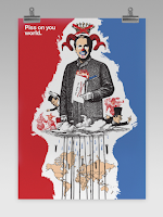
The seminar was about exploring convergence in greater detail. I was asked to create (within a group) something that had meaning to us, we were asked to look at newspaper and magazines and use key words that stood out to us to create something bold and meaningful. Our group chose to explore politics, here is the outcome...

Jonathan Lindley

Graphic Designer Jonathon Lindley presented todays lecture about convergence. He showed how design and communcation meet to create convergence and new ideas, there were clear points throughout the lecture that theory is a very important part of Graphic Design and that we should spend more time researching theory and theorists to become better developed Graphic Designers.

Convergence
  • The process or state of converging 
  • The coming together of two entities 
  • A meeting point
Culture can also be explored - ideas and social behaviour of a particular person or society 
OR
Culture can also be seen as an idea

Convergence is a point of translation and the moment of translation can be seen when design and communication 'meet.'

Friday, 30 September 2016

Thursday, 29 September 2016

Seminar - Genealogy

Today's seminar related around genealogy. We were given options to chose from and explore to generate new and creative ideas that might help spark a design. As a group we chose 'If dinosaurs were alive' we explored all possibilites about what would happen in the world if the case were that dinosaurs were still alive. 

Most of these ideas were just to help explain why we were exploring possibilites and link this to design - that we should explore every idea that we have and see the potential outcome.


A Sense of Place Introduction

I was introduced to the brief today, 'A sense of place'. I have a few ideas to explore, they mainly relate to my home town and city and I want to link them to my trip to New York earlier this year. I found New York to be one of the most exciting places I've ever been and want to compare how different the city is to being at home by exploring distance, the city and image.

Notes:

1st Brief : A sense of place

Engage in research and development in response to contemporary themes and to my own independent research

There are five themes to explore over phase one :
1. Exploring the city
2. The city as a species of space
3. The city as a system of objects
4. The city as an image
5. The city as a language

I will explore these themes in a sketchbook linking to my own ideas that were discussed in group activities.
1. Town / village
2. Distance


Monday, 26 September 2016

Manifesto

I have created my Personal Manifesto using simple words. I find these motivational and helpful.
The blocks of colour are a simple design but could also be seen as effective, they move forward and up - as a representation of my work and development throughout the course.


First blog of Graphic Design!

I'm so excited to finally have started the course, beginning with something that is going to motivate me throughout the next 3 or 4 years...

Manifesto
"A manifesto is a published verbal declaration of the intentions, motives, or views of the issuer, be it an individual, group, political party or government"

I am hoping that by creating my own in a creative way will help keep me motivated and inspired.

Notes:

Manifesto

Editing an existing manifesto to find words that inspire and mean something to me. 


I was asked to edit this original manifesto and chose key words or sentences that meant something to me and explain why. I chose words like persistence, imagination, explosive and urgent. I find all these words motivating and helpful, so that my work is different and attracts attention.