Showing posts with label Process and Production. Show all posts

Thursday, 6 April 2017

Typeface 3


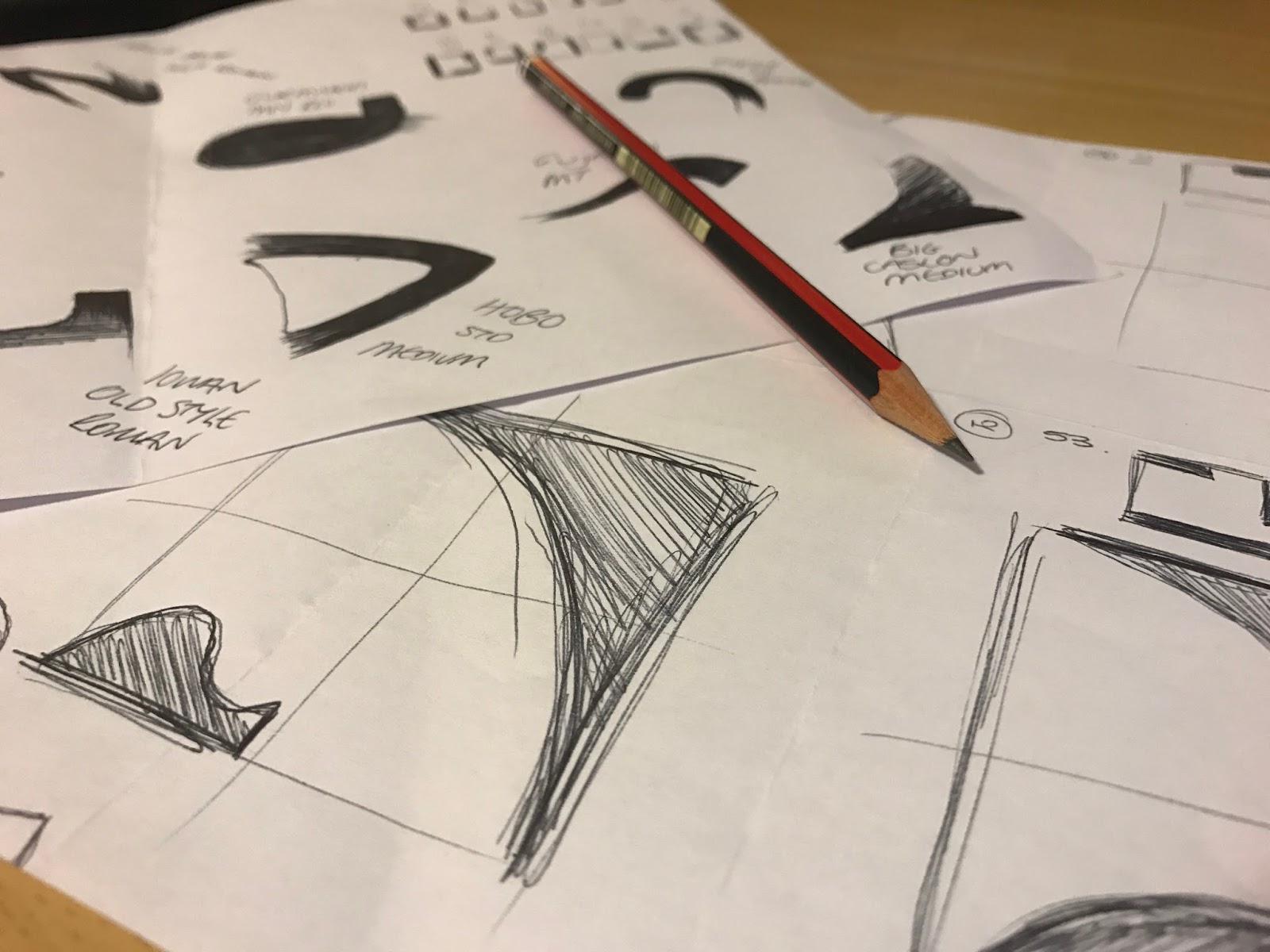
Today was a catchup workshop with John to finish our final Typeface designs. I've really enjoyed this workshop and love working with typography - so creating my own was great. The colours used for the drawing are slightly random because I couldn't find matching colours from the Bob Dylan poster - this will be present in the digital version.


The typeface I have designed is inspired by Milton Glaser, an American Graphic Designer that designs the I heart New York logo, Brooklyn Brewer logo and also the Bob Dylan poster which I used as my inspiration. I focused on the lines, curves and colours used to create the hair in the Bob Dylan poster, I produced the hand rendered version first as a guide for a final digital design. To allow myself to get the correct colours from the poster I made the type digital, after experimenting with the different colours used on the poster I like the idea of creating a theme, using specific colours to create a 'themed' type that could be used on websites, posters and anything that revolves around the colours. I used different shades of blue and pink/red to show how the typography might look if used. I'm really happy with the outcome of this, although it took a lot of time it turned out great...


Thursday, 30 March 2017

Flying Kite

Flying Kite from Maria Lynam on Vimeo.

Working with Illustrator and After Effects to create an animate object or animal that lives in the sky, I chose to stick with a simple approach but may continue to develop another video, looking at the animation of a dragon...

Thursday, 16 March 2017

Cinema4D

Spin from Maria Lynam on Vimeo.

Cinema4D Workshop

Today was an introduction to the Cinema4D programme and learning about basic tools to use in the future and throughout this workshop. We looked at...
  • Creating different shapes and moving them 
  • Lighting 
  • Shadows 
  • Texture Mapping
  • Typography
  • Animation
This is a short clip that has been modified and rendered to show how 3D effects work using shapes, lighting, shadows, pace and cloning.

Thursday, 9 March 2017

3D Typography

3D Typography - 'Let There Be Love' by Oasis from Maria Lynam on Vimeo.

A motion graphic clip relating to 3D Typography - created using Adobe Photoshop and After Effects

Thursday, 16 February 2017

Typography 2

Todays workshop was a continuation of the previous typography session, refining ideas and choosing the three best designs to move forward with. I chose to continue with the ideas inspired by Milton Glaser and Wyndham Lewis, generating the alphabet with the typography that I had created, I will continue to refine these ideas and chose between the three of them to develop further and digitally. 

Thursday, 9 February 2017

Helvetica

Helvetica

The workshop was about Adobe InDesign and the development of the Helvetica lecture, using our hand rendered work making paper based typography that represented a re-imagining of the letters that contained the words 'hand gloves' or 'Helvetica.' Our creations were scanned and then put into a folder for us to use in this workshop.


In groups we were asked to create a cover and sample page spreads for a design publication, we started by working on paper creating sketches and drawings to work from when going to produce the work on InDesign. We were given specific dimensions to use for the publication and then used the scanned work from the seminar to create what we wanted. This helped us with the development of discussing design concepts in short spaces of time and practice quality artwork production on InDesign, I found this lecture useful as practice for working in industry as it gave us an idea of what it could be like to be presented with a brief and work within a time frame.

Publication specification:
Page dimensions - W 152.4mm x H 228.6mm
Spine - 7mm
Cover overall - W 311.8mm x H 228.6mm
Bleed - 3mm all round
Full colour cover artwork, minimum of five interior double page spreads - as PDF files with bleed and crops
Time allowed, 3 hours.

As a group we had to consider what everyones role was in putting the publication together: creating a name for the document, creating the front page or producing a specific style that could be used throughout the pages. Every member of the group designed a few pages each after thinking of the name for the Helvetica publication and then we put them all together to create the ones shown in the blog post.

Thursday, 2 February 2017

Boucherie


Boucherie from Maria Lynam on Vimeo.

A few extra slides that I had created but didn't make it into the motion graphics clip:


Thursday, 26 January 2017

Typography 1

Today's workshop was focused on Typography in Graphic Design / Animation & Motion Graphics. I really enjoyed today's workshop working with typography is something I am fond of. Taking inspiration from other artists work to create our own typeface.

Part one of the task was to use the references provided to transcribe shapes to make letter forms and typographic characters, using the letters anesg. I took inspiration from Milton Glaser, Wyndham Lewis and Herbert Bayer - I also explored my own typography style just for practice and exploration of what else I could create using a pencil.


Thursday, 19 January 2017

Interactive PDF

Todays workshop was about creating an Interactive PDF document using Adobe InDesign, we looked at placing media files, creating buttons and sound onto a file that would then be presented using the PDF format. It involved learning about basic techniques that could help us present our work in the future.

Play Button
Thumbnails
The first stage involved setting up and placing the media file into the document, I made sure that the screen size was appropriate/standard at 1920 x 1080 pixels. In the workshop we used a video that had already been put together and set the video to 'Play on Page Load' and 'Show Controller on Rollover' this meant that the video is easy to play, pause and skip for viewers. We then added buttons using Photoshop, I made one to play (blue), rollover (green) and another to click (red.) I chose to use the LemonMilk font (as it's one of my favourites) and placed them into the InDesign document and activated them as buttons.
Adding sound

As well as buttons we also created thumbnails that allows viewers to click and it takes them to that second in the video. These were activated as buttons and then linked to the video. The next step was to add sound to the page, I tested how it would work if the sound played when the page launched but didn't like this idea so created another play button for sound that can be used whenever. I made sure to export the PDF to 'Interactive PDF' so that it can be opened and used correctly. My skills in Adobe InDesign are very limited at this moment in time but by continuing to use it and create documents like this will help me to understand it better. I hope to use these techniques for portfolios and other documents in the future as it worked out quite well.
Final look at the Interactive PDF

Thursday, 8 December 2016

Giraffe

Giraffe from Maria Lynam on Vimeo.

Created using Adobe Illustrator and After Effects 

Thursday, 1 December 2016

Physical Typography

Physical Type

Physical Studio

Today's session was about still life drawing and using the objects on each table to draw from. The first table being Physical Type, I chose to focus on the 'R' in the left hand corner to practice my drawing skills from this angle and seeing if I was able to get the right proportion, angle and shading right.

Typography focus with oil paste
Table two was Objects and I took the oppurtinmity to continue to look at typography instead of looking at the object compleyely I took out smaller details. I chose to use oil pastels for the rest of the drawings as I really enjoy working with them and love the marks they produce. I always like to get colour into my work and feel it works best when using oil pastels.


The third table was 'Life's A Box' which were a stack of boxes featuring the IKEA logo (which I took to drawing with the oil pastels again). I found that drawing the boxes was quite hard, getting the right angles and shape of the box was difficult to produce.


Thursday, 24 November 2016

Illustrator


Grid pattern for number 37
Exploring Adobe Illustrator and linking it with typography. The workshop was focussed around visual games within creative practice and particularly looking on the 'Morpholo' tile game designed by Thieri Foulc in 1985. Taking inspiration from this, the task was to focus on basic pen tool skills and the manipulation of typographic letters. I really enjoyed this task after understanding how it works and how to get each of the shapes or letters in the correct place, corresponding to the numbers for each tile.


Before beginning any digital based work I drew out and practiced some different types of fonts by hand, looking at close details that could be used to create alternate shapes for the tiles. I then took these skills to apply to the next text, developing the tiles - choosing 12 random numbers and figuring out how the number corresponds to the tile pattern:

I continued this for all 12 of the numbers and sketched out how they would look digitally.


Moving into Illustrator I then began to make to tiles using different letters and fonts to fill the black spaces. I really like the final outcome of them, they look abstract and unique.

Thursday, 17 November 2016

Hunger Games Trailer

Hunger Games Trailer from Maria Lynam on Vimeo.

Created using Adobe Photoshop and After Effects. Based on the novel, 'The Hunger Games' by Suzanne Collins

Thursday, 10 November 2016

Experimental Drawing

The process and production for today was about exploring a sense of place through drawing our surroundings, places like the studio, outside the studio and the area that we work in. I looked at different angles and how to draw from different view points, focusing on detail in some cases. I preferred using oil pastels today rather than pencil or pen, I found them easy to work with and created block colours and shading in some areas to make the drawing as realistic as possible.


Thursday, 20 October 2016

Photoshop

Process and Production : Photoshop

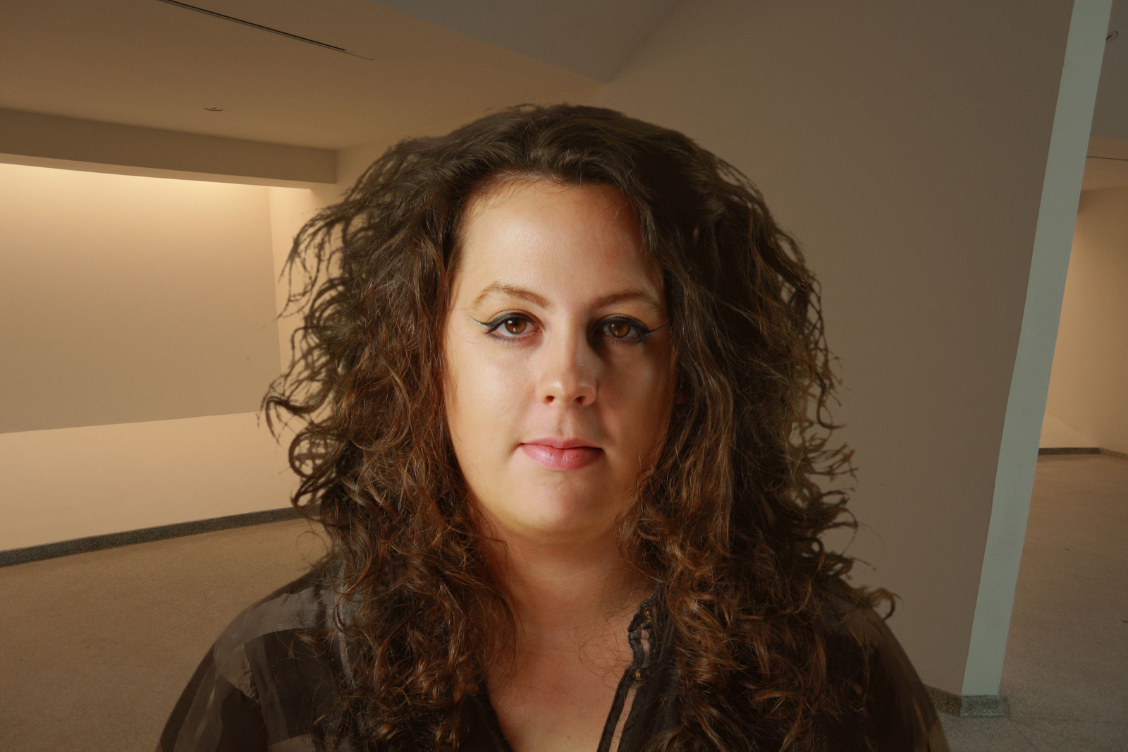
Today was about developing Photoshop skills and learning how to mask and overlay images to create different montages. I took an image taken in the first week (portrait of me) and used photoshop to make it appear on another background. I took the image (JPG File) and opened it into Photoshop. I created a duplicate layer of this so that it is easier to cut out the image and mask. I used chroma key to cut myself out from the background (green screen) and added a solid block colour to the background as a temporary. Choosing from a variety of background pictures I decided to keep within the theme of warm browns and cream colours so that the image would look more realistic by playing with the hue and saturation and levels of both the image and background. 
I really enjoy working on Photoshop and developing skills, I will continue this practice in my own time and whenever necessary so that I become quicker and create better looking pieces of work. 

 
A screen grab of the layers used in Photoshop to create the image below.


Thursday, 13 October 2016

Colour

Colour from Maria Lynam on Vimeo.
Video created in Adobe After Effects. The use of colour to combine with the beat from the music to create a simple 10 second clip.

Thursday, 6 October 2016

Real Life Drawing

The afternoon consisted of visiting Huddersfield town centre to look at the buildings, architecture and typography used throuhgout. We decided to explore the market place and capture the busier buisness atmosphere in the drawings. I like to work in fine liner and pencil I find both easy to sketch with and quite like the end result. All the drawings were then put together on the wall to show all the other areas that were documented, including Byram St and St Georges Hotel.


Friday, 30 September 2016

Monday, 26 September 2016

Manifesto

I have created my Personal Manifesto using simple words. I find these motivational and helpful.
The blocks of colour are a simple design but could also be seen as effective, they move forward and up - as a representation of my work and development throughout the course.