'a particular design of type'
Font
'A font is the combination of typeface and other qualities, such as size, pitch, and spacing.'
The lecture today was about typography and exploring different types of type and how they might be used or have been created. Looking specifically at Jan Tschichold's book "The New Typography" published in 1928, a book that shows striking composistions and tells the viewer how the pages work with type and images together. The book is organised around the following principles:
- Asymmetric balance of elements
- Utalisation of white space
- Sans serif typography
- Advocated lower case letters
- Supported the typo-photo approach
- Content was designed by the hierarchy
 |
| "Universal" typeface |
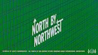
I learnt something new today in the lecture, kinetic type. It appears everywhere today as type that moves with simple animations. It offers the reader a different way of looking at the type and shows how it can expand, shrink and morph on the page in front of you to keep you interested. Kinetic type appears in an order and we usually see them on TV adverts, blogs and landing pages.
 |
| Screen grab of title sequence |
Lastly, we looked at conceptual type, there is no clear cut definition for this type but Peter Bil'ak (Slovakian graphic designer) said 'Before the typeface is executed, it is not a typeface, it is simply an idea."
Reference:
Image of "Universal" retrieved from http://www.widewalls.ch/bauhaus-typography/herbert-bayer/
Screengrab from trailer retrieved from https://www.youtube.com/watch?v=KVUnUmPV33c