Thursday, 6 April 2017

Typeface 3


Today was a catchup workshop with John to finish our final Typeface designs. I've really enjoyed this workshop and love working with typography - so creating my own was great. The colours used for the drawing are slightly random because I couldn't find matching colours from the Bob Dylan poster - this will be present in the digital version.


The typeface I have designed is inspired by Milton Glaser, an American Graphic Designer that designs the I heart New York logo, Brooklyn Brewer logo and also the Bob Dylan poster which I used as my inspiration. I focused on the lines, curves and colours used to create the hair in the Bob Dylan poster, I produced the hand rendered version first as a guide for a final digital design. To allow myself to get the correct colours from the poster I made the type digital, after experimenting with the different colours used on the poster I like the idea of creating a theme, using specific colours to create a 'themed' type that could be used on websites, posters and anything that revolves around the colours. I used different shades of blue and pink/red to show how the typography might look if used. I'm really happy with the outcome of this, although it took a lot of time it turned out great...


Thursday, 30 March 2017

Flying Kite

Flying Kite from Maria Lynam on Vimeo.

Working with Illustrator and After Effects to create an animate object or animal that lives in the sky, I chose to stick with a simple approach but may continue to develop another video, looking at the animation of a dragon...

Monday, 27 March 2017

Telling Tales: Iconography & Authenticity


Iconography is from the Greek words 'Image' and 'to write'. It is the identification and description of the content of images, the study of symbols depicted in a work or art design. Traditionally, these symbols derive from a readily recognisable, common currency of cultural experience.

WJT Mitchell, Art Historian: 'Iconography is about the rhetoric of images,' that is, it helps us to know 'what images say and what to say about images.'

All these symbols have a meaning and they all determine peace:
Dove - depicts something in a real world, it is instantly recognisable as opposed to abstract
Peace - colourful and abstract
White Flag - relies on colour to show a message, peace.

Peter Burke, Historian: Images 'speak', they are 'designed to communicate'. 'To interpret the message it is necessary to be familiar with the cultural codes'. We all share an understanding of context.

Richard Howells, Visual Culture, 2003: 'Paintings have meanings that the artist would expect the viewer to understand. Successful communication of these meaning, however, it depends upon shared cultural conventions between painter and viewer'.

Byzantine Portraiture: We are able to trace iconography through history. Symbols within the painting depicted an idea and it is no longer about representing reality, it was an idea through symbols, making connections through earthy material. The lamb around his neck suggests that he might be a shepherd OR he is possibly Jesus, who was seen as a good shepherd - using our knowledge of the context.

Iconology: 

  • The study of meaning contained within these iconographic symbols, i.e. the interpretation of the content of the images
  • The branch of art history that addresses the description, analysis and interpretation of images
  • Iconology looks at more than the face value of the symbol, taking into account its context - both historical and cultural, as well as in relation to the artist or designers broader oeuvre of work
Importance of 'historical and theoretical context' - Erwin Panofsky - iconologist - Studies in Iconology (1939). Using visual evidence to 'unlock' meaning. Looking as opposed to just seeing. 

Take a painting for example:
  • The first stage of analysis: What do we see at face value? What genre is it? What is it a painting of? Is there any text?
  • Second stage: What do we see when we read between the lines? What else can we say about it? What details are evident?
  • The effective communication of meanings through visual devices requires shared cultural conventions between viewer and reader and an understanding of context (the circumstances that form the setting for an even, statement, or idea, and in terms of which it can be fully understood).
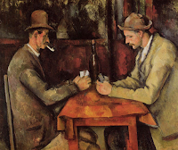
Van Gogh, The Card Players, 1894-5
It is a painting that we can start to develop a recognised abstract idea of, using light and colour it is not super realistic. People are sat around a table, we can also read into the title to make an assumption of what the two men are doing. We don't know their relationship, where they are or who is winning the game of cards. There are a lot of other questions that the viewer has.

Metaphor
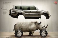
A type of analogy where meaning is derived through association, comparison or resemblance. It equates two things in order to make an impact, for example: this image is a s sense that they are trying to tell us that the car is strong. The rhino is where the engine would be, it triggers ideas and is an example of a visual metaphor.

Two images:
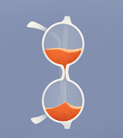
One shows an apple growing into a tree with typography displaying the idea of the seed growing into ideas and creativity. We are then left to interpret the other image without type. The viewer can make decisions about what the image means: a pair of glasses that also appear as an egg timer, it shows associations around time, patience and could also suggest a sense of emergency (time runs out) The glasses suggest intelligence, suggesting to the viewer that with patience comes wisdom.

Symphony in Slang, Tex Avery, 1951
He uses an idea of a metaphor and makes it come first, a metaphor is all of the meaning, he has inverted the way of using a metaphor.

The Creative Act, Marcel Duchamp, 1957
'All in all, the Creative Act is not performed by the artist alone; the spectator brings the work in contact with the external world by deciphering and interpreting its inner qualifications'.
The audience is just as crucial, it is about visual understanding.

Desperate Housewives, Title Sequence 
It introduces famous works of art, all that have iconographic meaning. Hidden meanings, to show how we interpret the characters in desperate housewives.

The Arnolfini Wedding Portrait, Jan Van, Eyck 1434
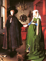
Decode the image and ask questions, every element of the painting has a story to tell. Whilst taking a glance at the painting we don't notice key elements like we would when we look into the painting - Is the woman in the painting pregnant? Is it actually a wedding portrait? It shows a mirror in the background that reflects the room, opposing questions about where the artist stands as he isn't in the mirror.

The Ambassadors, Hans Holbein, 1533
The painting shows religious and scientific symbols, it is a detailed portrait but we can also see a distorted skull - it is distorted to the viewer and communicates messages, an interpretation of death.
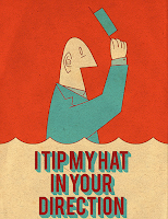
Erwin Panofsky - Three levels or 'strata; of iconological meaning:

  • Primary - see colour, shape, read text
  • Conventional - relies on common understanding and shared knowledge 
  • Intrinsic - what does it all mean? start to make assumptions, right or wrong - for example the image is a man that is lifting his hat, a good gesture and considered polite and friendly
Authentic
  • Unique
  • Common
  • Copy
  • True/False
  • Real
  • Imitation
  • Genuine
  • Counterfeit
  • Original 
What does it mean to be authentic?
For many the search for authentic provides a powerful source of meaning in a secular age, allowing a person a unique personal identity in a world that seems alienating and conformist. This demand for authenticity - the honest or the real - is one of the most powerful movements in contemporary life, influencing our moral outlook, political views and consumer behaviour. 

'Craftsmanship names an enduring, basic human impulse, the desire to do a job well for its own sake'. Richard Sennett

In seeking to make objects which avoided the appearance of fine art, the Minimalists attempted to remove the appearance of composition from their work. To that end, they tried to expunge all signs of the artists guiding hand or thought processes - all aesthetic decisions - from the fabrication of the object. For Donald Judd, this was part of a Minimalism's attack on the tradition of 'relational composition' in European art, one which he saw as an out-moded rationalism. Rather than parts of an artwork being carefully, hierarchically ordered and balanced, he said that they should be 'just one thing after another'. 

The idea of removing them from the thought processes, creating a distance and how that might effect how authentic something might be.

Monday, 20 March 2017

Seminar - Meme

Meme, 'an element of a culture or system of behaviour passed from one individual to another by imitation or other non-genetic means'

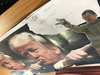
Looking at satire 'a critique or attack, driven by a desire to make a social commentary or to challenge the status quo but which employs humour as its weapon to do this. It asks the viewers to think about the artwork' we were asked to create our own meme for a chosen picture, the group looked at Donald Trump and created a meme about his relationship with his wife and his thoughts about building a wall, relating to Mexican people.

Postmodernism & Appropriation Part 2

Pastiche, Parody, Satire & Authenticity

Appropriation - MOMA definition...
The intentional borrowing, copying, and alteration of pre-existing images and objects. It is a strategy that has been used by artists for millennia, but took on new significance in mid - 20th-century America and Britain with the rise of consumerism and the proliferation of popular images through mass media outlets from magazines to televisions.

Andy Warhol, Orange Disaster, 1963

  • Electric chair with final execution
  • The image shows a metaphor for death with repetitive designs 
  • Reducing it to meaningless
  • When we view an image over and over again it loses it effect
Repeating something over and over tells the audience that it is less effective it loses its meaning.


Marcel Duchamp, LHOOQ, 1919
  • Readymade - a commonplace prefabricated object isolated from its functional context and elevated to the status of art by the mere act of an artists selection
  • Assisted Readymade - where slight interventions have been made to such an object  
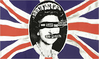
God save the Queen (the Sex Pistols), Album cover by James Reid
  • Appropriation of the Queen
  • Appropriation of newspaper, like a ransom note - making her vulnerable 

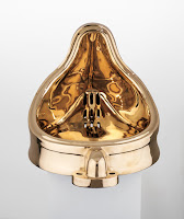
Sherrie Levine, Fountain, (After Marcel Duchamp) 1991 

Commenting on the status of the readymade, she makes new versions of the art and gives them new meaning. Used making bronze, its valuable and has been transformed to unique object. It is the opposite of Marcel Duchamp's original piece, in a way she is showing the way we appropriate past forms we use them to carry on interesting discussions, dialogues before them.
'I try to make art which celebrate doubt and uncertainty...'


Satire
A critique or attack, driven by a desire to make a social commentary or to challenge the status quo but which employs humour as its weapon to do this. It asks the viewers to think about the artwork

'Cartoon'
1670s a drawing on strong paper from French carton, and from Italian cartoon 'strong heavy paper, pasteboard,' thus 'preliminary

Punch Magazine, John Leech, Cheap Clothing, 1845
Represents inequality between men and women

John Holcroft, c.2007
Makes stylised illustrations...


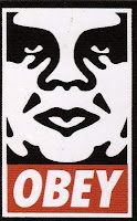
Jeff Rankin after Shepherd Fairey, and re-appropriated version, 2008-17
Idea of a dialogue, a conversation between the designers and audiences that they are presenting them too. It enhances the impact of the other for each different one.

Parody
or visual punning, is a form of visual satire the practice of copying

'Rango' (film) consistently aimless

Pastiche
is a form of 'homage' Like a parody it copies or mimics...

Daniel Eatock, Everything Heinz, 2009

The Guerrilla Girls, 1989
Promoting an idea, delivering a subversive message
Sexual and racial discrimination
Protect their identities in public by wearing gorilla masks
1985 poster campaign that targeted museum and artists that excluded women from exhibitions
They took on board using the image to make a social commentary
Appropriation, nude figure being used

Culture Jamming, Shepherd Fairey 1989
Hijacking of media was common, became a popular activity among Graphic Designers and Artists

Adbusters campaigns
Canadian based non profit company, found in 1989. Anti-advertising

Thursday, 16 March 2017

Cinema4D

Spin from Maria Lynam on Vimeo.

Cinema4D Workshop

Today was an introduction to the Cinema4D programme and learning about basic tools to use in the future and throughout this workshop. We looked at...
  • Creating different shapes and moving them 
  • Lighting 
  • Shadows 
  • Texture Mapping
  • Typography
  • Animation
This is a short clip that has been modified and rendered to show how 3D effects work using shapes, lighting, shadows, pace and cloning.

Monday, 13 March 2017

Seminar - Postproduction

Seminar - Postproduction
  • Post-produce the text and image excerpts provided to you by changing them using processes of deconstruction, intervention, layering, concealing, revealing, repositioning, enhancement, embellishment, destruction, creation. 
  • Use your phone to make a short time-lapse film of this process, and of the outcomes
  • If you use Instagram, post your finished time-lapse, using the hashtag #cutups


    I really enjoyed this task, it gave us a chance (as a group) to develop ideas from work that currently exists and create a new piece of work. We then left the work for the future groups to add to and for them to create the new pieces of work. 

Postmodernism & Appropriation - Post Production

Postproduction can be defined as...

  • The stage in the production of a media output, involving editing
  • A set of processes applied to recorded material, e.g. montage, voiceovers
  • It can be seen as taking data that has been captured, cutting it up, moving it around and filtering and shaping it into a finished piece of work

Digital Media
...something that is encoded and machine-readable which can be created, viewed, distributed, modified and preserved on digital electronic devices is contrasted with print media, such as print books, newspaper and magazines

Nicholas Bourriaud, Postproduction, 2002
How Art Reprograms the World
Artists are taking work today and interpreting, reproducing, re-exibiting or use works made by others or available cultural products to create our own.
'The activities of DJs, Web Surfers, and postproduction artists imply a similar configuration of knowledge, which is characterised by the invention of paths through culture' Cultural information is out there and its up to you as a creator to figure out a path through these things to then develop ideas.

How are cultural practitioners using postproduction...
  • They create hybridised art forms emerging out of interdisciplinary media art practices
  • Using new media technologies to both compose their art work as well as display it on networked place
  • Repurposing or versioning their works in-process for a write array of media genres and platforms
  • Using online performance of digitally constructed or fictional artistically generated identities , a more open mindedness to alternative distribution where we locate audiences via electronic media, underground club spaces, store fronts, DVD labels, social networking sites but also in combination of more traditional venues such as museums, print publications, university art centres and galleries.
Marcel Duchamp, Fountain, 1917
To create is to insert an object into a new context or scenario to consider it an element of a bigger narrative. In a sense, the works journey becomes part of a dialogic process - each artistic, curatorial or interpretive decision made on its behalf might be compared to conversational turn-taking

 Bricolage...
  • In art or literature construction or creation from a diverse range of available things
  • Bricolage does not necessarily need to have a clear end 
  • Bricolage means to engage in a dialogue with a heterogeneous collection of materials and tools, in which items are repurposed to solve a problem 
  • 'The expansion of available information and exposure to diverse cultures and networks' increases the opportunities for Bricolage (Wuthnow 2010)
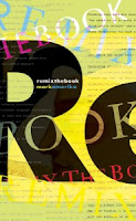
Mark Amerika, Remix the Book, 2011
'DIY trends in contemporary practice [...] challenge our 20th century notions of what an artist is.'

Amerika develops a model of contemporary theoretical writing that mashes up the rhetorical styles of performance art, poetry and the vernacular associated with 21st century social media and networking culture. 
'Remixes' for America might include literary cut-ups and procedural composition, image appropriation, internet art and sound art. 


Thursday, 9 March 2017

3D Typography

3D Typography - 'Let There Be Love' by Oasis from Maria Lynam on Vimeo.

A motion graphic clip relating to 3D Typography - created using Adobe Photoshop and After Effects

Seminar - Abstract & Conclusion

Seminar

The seminar was a brief catchup about what we had learned the past few weeks and a conclusion to handing in the first section of the essays. We looked at the Abstract and Conclusion part of the essay as the final pieces of writing before it is completely finished. We practiced writing the abstract using a clip from the lesson and making sure that we picked out the key points:

  • Where you are
  • What you are doing
  • How you are doing it 
  • Where you will find it 
In other words, the situation, process, relations and the conclusion to what we had seen on the clip, using this method we have to apply it to our essays for the abstract. 

For next lesson I need to write up as much as the abstract as possible and also bring in my completed essay.

Self- negotiated Introduction

Today we were introduced to the final brief of the year, a self-negotiated task that relates to our essay topics, mine being 'Subcultures'. It will involve creating our own brief from scratch and writing, designing and creating a magazine in relation to the chosen topic and question that we had written for ourselves.

Monday, 6 March 2017

Jay Payne

Guest Lecture

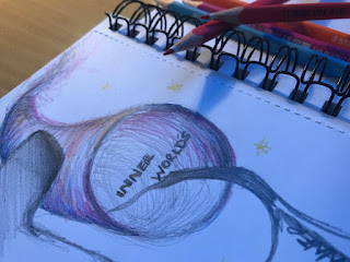
Today we had a guest lecture from Jay Payne about bridging theory and practice together in subtle ways. We were asked to 'doodle' and make visual notes about the lecture instead of written notes. I chose key words from Jay's lecture, looking at typography - something he had mentioned that he enjoyed. I also enjoy typography so thought to try some 'doodling' with initials and also picked out the key word 'inner worlds' something that Jay mentioned. I decided to take the words quite literal and 'doodle' about going into other worlds, this could help explore new innovative ideas and help me create something different.


Thursday, 16 February 2017

Typography 2

Todays workshop was a continuation of the previous typography session, refining ideas and choosing the three best designs to move forward with. I chose to continue with the ideas inspired by Milton Glaser and Wyndham Lewis, generating the alphabet with the typography that I had created, I will continue to refine these ideas and chose between the three of them to develop further and digitally. 

Thursday, 9 February 2017

Helvetica

Helvetica

The workshop was about Adobe InDesign and the development of the Helvetica lecture, using our hand rendered work making paper based typography that represented a re-imagining of the letters that contained the words 'hand gloves' or 'Helvetica.' Our creations were scanned and then put into a folder for us to use in this workshop.


In groups we were asked to create a cover and sample page spreads for a design publication, we started by working on paper creating sketches and drawings to work from when going to produce the work on InDesign. We were given specific dimensions to use for the publication and then used the scanned work from the seminar to create what we wanted. This helped us with the development of discussing design concepts in short spaces of time and practice quality artwork production on InDesign, I found this lecture useful as practice for working in industry as it gave us an idea of what it could be like to be presented with a brief and work within a time frame.

Publication specification:
Page dimensions - W 152.4mm x H 228.6mm
Spine - 7mm
Cover overall - W 311.8mm x H 228.6mm
Bleed - 3mm all round
Full colour cover artwork, minimum of five interior double page spreads - as PDF files with bleed and crops
Time allowed, 3 hours.

As a group we had to consider what everyones role was in putting the publication together: creating a name for the document, creating the front page or producing a specific style that could be used throughout the pages. Every member of the group designed a few pages each after thinking of the name for the Helvetica publication and then we put them all together to create the ones shown in the blog post.

Seminar - Descriptive Writing

We started the class with peer marking and exchanged writing with each other to continue to give feedback and points about how we could improve our writing. The previous task was to create a visual diagram that described our essay or told other people what it might be about, we then discussed what and why we had drawn the images or mind maps and how we interpreted it into our essays. I found this task quite useful for finding out how other students work and what techniques other people use to create their work that I could maybe take on and use in my own way.

Monday, 6 February 2017

Animation Heroes

Animation:
"the state of being full of life or vigour; liveliness"

We looked at how animation effects us and the theories used to describe it like, theories of play:
  • Child Development Theories 
  • Social Development Theories
Child:

People like Sigmund Freud focussed on abnormal behaviour, children beyond the norm with delayed abiltiy and B.F. Skinner looked at the idea that children's behaviour is determined by its consequences which make it more or less likely that the behaviour would occur again. 

Social:
John Bowlby - 'Attachment Theory' which looks at parents and their relationships with their children
Albert Bandura - 'Social Learning Theory' - observing and taking on behaviours which reinforces satisfaction in others 
Jean Piagets - 'Stages of Cognitive' - mental processing and recognising how children got some understanding to become active learners, they are naturally curious and driven to learn new things for themselves by doing new things
Lev Vygotsky - 'Sociocultural Theory' - looking at imagination, children are unable to do certain things adolescents can e.g. riding a horse. Therefore when children grow older their imagination starts to change and become different

Culture & Emotion 

"Popular culture is a category which floats ambiguously between the anthropological and aesthetic" 
"The idea of culture" Terry Eagleton Oxford Prof. 

Goleman 'Emotional Intelligence'
HAPPINESS is a universal positive core emotion 

Kobayashi & HarĂ¡ ' Facial Recogniton'
Surprise/Fear/Disgust/Anger/Happiness/Sadness

McCloud 'Storytelling and Meaning'
Meaningful connections and communication through animation and products

Playful Politics - They reflect what is going on in the news and how they portray it makes us the audience know that they are just having fun, by showing that it is funny for the children however adults know that there is a something against them or the audience that is going on in the world. Giving people the narrative to change their opinion on things and the only things that could really be read or watched all convey the same messages, animation is something that allows others to read another message from it. An example of this would by The Recession - 'Top Cat' showed the view of homeless people trying to get through life with less money. 

Sofa Satire - The Simpsons and Family Guy make fun out of the media and sometimes take jokes too far, following real life stories and shows them through humour.

Girl Culture - consisting of all things nice like The PowerPuff Girls, Dora the Explorer which provides advertising towards certain audiences e.g. purchasing merchandise like dolls

Authority - South Park looks serious issues that have not been looked at in America and turns them bold issues into things that children would not understand but after watching the programme they then continue to pass the messages on which means the show gets to the point much easier and quicker.

Us & Them Branding - SpongeBob SquarePants and Fairly Odd Parents cater too all needs and make it something that you can watch repeatedly suggesting that there is something in it for our children to understand and causes adults to look deeper into the show to understand it 

Thursday, 2 February 2017

Seminar - Writing by Comittee

Today was about marking each others work at the start of class as a way to receive positive feedback and make improvements if necessary. We were asked to read the piece of writing three times, this is to help us notice any mistakes we might miss the first time we read something - it could also be helpful for my own use when I continue with my essay to ensure that everything reads properly without mistakes.

The task was to write down 3-8 words in connection to my essay, this was to help open different paths and ways of looking at your own essay and each others. The class then got into groups and were given an image to write down 10 key words, making sure they were descriptive, creative and 'over readings'. The image and key words were passed to another group for them to write a description using the words that had already been written down.

Boucherie


Boucherie from Maria Lynam on Vimeo.

A few extra slides that I had created but didn't make it into the motion graphics clip:


Monday, 30 January 2017

same, same but different


Today's lecture was an introduction to structure, chance and algorithms in a selection of visual and graphic arts. We first looked at 'nature' with a focus on the Fibonacci Sequence and Golden Spiral. The Fibonacci Sequence is a series of numbers where a number is found by adding up the two numbers before it e.g.

0, 1, 1, 2, 3, 5, 8, 13, 21, 34 and so forth. 

The Golden Spiral is understood as 1: 1.618 and is derived from the Fibonacci Sequence in which each number is the sum of the two numbers before it. The difference between any two numbers in the sequence isn't always exactly equal to 1: 1.618 but close. 

Kenneth Martin
Joe Gilmore / Tom Betts

A collaboration to create 'rand ()%' is a departure from many of the other works presented as Dots & Lines. While most of the pieces in the exhibition use imagery to challenge our conception of what a score can be, rand ()% offers a powerful yet invisible notion of a score. Rand()% is also an automated net.radio station streaming generative music.

Kenneth Martin

Chance & Order - They typify Martin's commitment to simple sequences 'like the notes on a piano; and a few simple rules producing results which 'could be like a fugue.' He creates his pieces of work through the chance of picking numbers from a hat that help him decide where he would strike different coloured lines on the page.
Darrell Viner

Darrell Viner 

Viner was a pioneering sculptor that worked with movement, he was also a pioneer in the field of computer art. He originally turned to computers to pursue his interest in movement and animation and applied technology to kinetic sculptures. 

Joshua Davis

Davis is an American designer, technologist and author/artist in new media. He is best known as the creator of praystation.com and uses Macromedia Flash and Processing as tools to create art. I liked Davis' work the best out of all the artists, working with plenty of colour and different patterns to create exciting visual compositions. 
Joshua Davis

Thursday, 26 January 2017

Seminar - Describing Images

Today's seminar was about the progression of our essays, by using peer marking to get a different insight into what other people thought about what we had written so far. It was a closed reading task to help us with ideas on how we could write differently and learn from each other.

We also looked at images that were brought in relating to the essay and had to describe them in three sentences, keeping them concise - just how the essay should be. The class were asked to match our descriptions to the images, by doing this task it meant that we learnt about writing good descriptions, thinking about detail and look at the image differently to see how others view it and give their opinions on what they see.

Typography 1

Today's workshop was focused on Typography in Graphic Design / Animation & Motion Graphics. I really enjoyed today's workshop working with typography is something I am fond of. Taking inspiration from other artists work to create our own typeface.

Part one of the task was to use the references provided to transcribe shapes to make letter forms and typographic characters, using the letters anesg. I took inspiration from Milton Glaser, Wyndham Lewis and Herbert Bayer - I also explored my own typography style just for practice and exploration of what else I could create using a pencil.


Transformation

Today was about generating a central idea and developing it to create new ones. I was taught a new technique that I will definitely use in the future, I found it very helpful for creating completely new ideas. The technique is as follows:

  • Generate a central idea - visualise the idea and create thumbnail sketches, surround the sketches with key words that also tell you about the unique points about the idea
  • Transformations - explore the unexpected and invert one element from the image to explore different outcomes - continue this transformation technique to help generate a whole range of other ideas