Monday, 28 November 2016

Design & Emotion


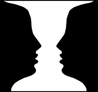
Today's lecture was about emotional engagement and meaningful communication, presented by Tracy Lannon. We looked at how engaging in different types of information would help us create designs with meaning and have some purpose to others. Throughout the presentation we looked at image illusions and how others view them differently. Illusions are created using certain angles, patterns and colours to present an image that the eye cannot understand, we as humans have to filter things down to make sense of happenings. Our expectations dictate our emotional attachment: we look for the same kind of things, preparing us for what we will see next time and what we want to take notice of e.g. The image either shows a white vase or two faces looking directly at each other, it is known that most people look at the faces first because they are something we see in everyday life and there is more focus than a vase.

Visual Stimulation:
All the information we receive is upside down, our brain flips the image and sends it to another part that best fits to understand what it is we are looking at. The retina in our eye is made up of two cells: the cone cells which only see black and white and the rod cells that see colours. We looked at two tests, the first: draw a cross and a dot on separate sides of a piece of paper, cover one eye and move the paper in our vision from side to side - when the dot or cross were out of our vision the cells were not able to work.


The second test was to look at the circles on the left hand side and pick out the numbers in each shape. With all the different dots and colours involved in the images it shows that colour blind people would not be able to understand what the number is inside the shape.


Thursday, 24 November 2016

Illustrator


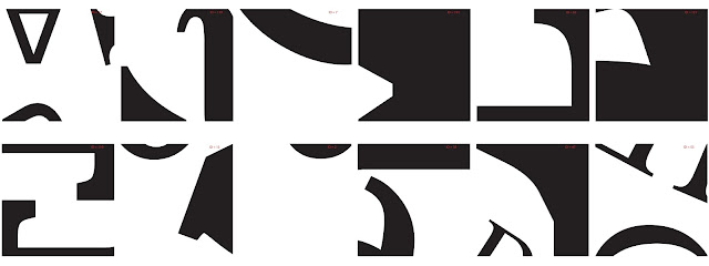
Grid pattern for number 37
Exploring Adobe Illustrator and linking it with typography. The workshop was focussed around visual games within creative practice and particularly looking on the 'Morpholo' tile game designed by Thieri Foulc in 1985. Taking inspiration from this, the task was to focus on basic pen tool skills and the manipulation of typographic letters. I really enjoyed this task after understanding how it works and how to get each of the shapes or letters in the correct place, corresponding to the numbers for each tile.


Before beginning any digital based work I drew out and practiced some different types of fonts by hand, looking at close details that could be used to create alternate shapes for the tiles. I then took these skills to apply to the next text, developing the tiles - choosing 12 random numbers and figuring out how the number corresponds to the tile pattern:

I continued this for all 12 of the numbers and sketched out how they would look digitally.


Moving into Illustrator I then began to make to tiles using different letters and fonts to fill the black spaces. I really like the final outcome of them, they look abstract and unique.

Seminar - Jonathan Lindley


The seminar was focussed on Branding and Anti-Branding.

The task was to chose a brand we disliked and re-brand it.
I don't particularly 'hate' Covergirl but I know they use animals to test their products. I changed the tagline from 'Easy, Breezy, Beautiful...' to something that would catch the audience's eye and make them think about what brands they are buying and how they treat animals.


Module Assessment

(a) Concept Development
Successful exploration of a problem or theme demonstrated through the development and documentation of appropriate creative concepts and alternatives

(b) Aesthetics and Language
Creative decisions are made in response to thematic projects and are based on appropriate aesthetic criteria. The ability to discuss these in relation to the work produced and other diverse sources is demonstrated. 

(c) Technical Response
Appropriate technologies are selected in response to thematic projects. The ability to discuss these in relation to the production of the work is demonstrated. 

(d) Integration and Synthesis
Awareness of the need to reconcile conceptual/critical issues with the contexts of genre and audience is demonstrated

Monday, 21 November 2016

Seminar - Semiotic Analysis

Semiotic analysis in Advertising

Semiotics calls attention to the formal structure of signification; of meaning-making in a culture.

The task was to watch Christmas adverts and what messages they are communicating in each example. All of the adverts communicate the message about 'family' and coming together at a special time of the year, Christmas. It's about value and what people value - their families. The songs that pair with each advert connote love and families, about being together which are all relevant for the images shown in the adverts.

Christmas Adverts:
John Lewis - Buster the Boxer
M&S - Mrs Claus
Sainsburys - World War 1
Goggle Box - Animation about M&S Advert
John Lewis - Man on the Moon

Meaning and Message

Introducing Semiotics

Today's lecture was an introduction to semiotics and how they are used in Graphic Design. We looked at what semiotics actually were:
  • Theories that explore how the system of signs work to make a meaning
  • They represent ideas and create meanings for things such as words or images
  • It is how one thing can be used for something else
  • They make sense of the visual world
  • They communicate to the viewer visually and verbally
 All good designers are semioticians and understanding semiotics can help up communicate messages effectively. We also explored why we should understand semiotics and how they work:
  • How words and images work together
  • Shows how visual communication works
  • Design choices affect and transform the message
  • How text and image can be manipulated to benefit the messages
Semiotics can be seen as signs, which can also be seen as multiple different things:
  • Spoken or written language
  • Images
  • Objects
  • Gestures
  • Codes
  • Symbols
  • Sounds
  • Pictures
Signs can also have an emotional impact on the viewer, they can mean different things to different people dependant on their cultural experience, their differences and expectations. With different types of semiotics such as signs there are semiotics for colour which is a way in which colour is expressed and with certain information that make the viewer understand the message or feel a certain emotion - this is also culturally conditioned for each individual. Commercial world takes advantage of our ability to associate colours with meaning e.g. Red can connote passion, love and lust.

'Languages differ by differentiating differently - John Passmore

Charles Sanders Peirce says that there are three categories of signs:
  • Symbol - No logical connection between the symbol and the thing it is symbolising
  • Icon - Resembles the sign, there is a likeness
  • Index - A direct link between the sign and the thing it is representing, there is a factual connection
There are also such things as creative semiotics meaning that to understand the semiotic means you can play with how the words and images communicate with the viewer, they enable us to explain why and how clever use of text and image 'work' together e.g. Anthony Burrill 'Oil & Water Don't Mix'

Anchorage and Relay (Roland Barthes)
Text which anchors or constrains how the image is read. The reader is directed by 'how the signifier or image is read'it  clarifies or 'anchors' the meanings through visual clues. Where the image is complex, it helps to underline a relationship between the text and image e.g. advert, map, narrated documentary. The words and images tell a story equally - they stand in a relationship.

Thursday, 17 November 2016

Hunger Games Trailer

Hunger Games Trailer from Maria Lynam on Vimeo.

Created using Adobe Photoshop and After Effects. Based on the novel, 'The Hunger Games' by Suzanne Collins

Seminar - Essay

Looking at some possible questions for the essay. I am planning on writing one about subcultures as I find this the most interesting question so I have written down some ideas and done some research that could help answer them:

Two possible questions I am considering:

1.       Discuss the effect of women within the ‘gaming world’ as a subculture on graphic designers

2.       Discuss the effect of Britpop subcultures on graphic designers

Definitions:

1.       I want to explore women in gaming and how they are represented and viewed by others as a subculture. The gaming industry specifically use men as a target audience as appose to women – this is something that I will be researching further and looking into more detail. I also want to find out why this is current and what it is about the ‘gaming world’ that doesn’t ‘accept’ women

2.       Britpop is something I’ve recently become interested in – look at fashion and type of music it was e.g. indie-rock and why it has recently become so popular. Maybe compare to the era previous e.g. punk

Relevant links that could help for Question 2:


K IS FOR KINGS OF COOL BRITANNIA

Whether it was Brett Anderson from Suede posing in front of Blighty’s flag on the cover of Select magazine or Noel Gallagher wielding his patriotic guitar before a crowd of thousands, the UK flag was the unofficial badge of Britpop. It was this sense of national pride that helped popularise the genre, where lads singing about binmen and supermarkets brightened up the mundanity of everyday life. While the acerbic rivalry between Blur and Oasis may be the most abiding memory of the 90s subculture, its style legacy – shaggy hair, parkas and a sneery attitude – shouldn’t be forgotten. Think Mods, but the kind who’d ruck at a football match.


Something called ‘Lad culture’ was a British subculture initially associated with the Britpop movement. The image of the “lad” was that of a generally middle class figure exposing attitudes typically attributed to the working class. The subculture involves young men assuming an anti-intellectual position, shunning sensitivity in favour of drinking, violence and sexism.

Monday, 14 November 2016

Seminar - Typography

The seminar was about creating our own typography inspired by Joseph Albers. He created the typeface, 'Stencil' in 1926 with the aim of creating a simple and easy to read and use typeface, it is based on geometric forms.
The task was to create the modern day alphabet using the typeface, here are some examples:


Type

Typeface
 'a particular design of type'

Font
 'A font is the combination of typeface and other qualities, such as size, pitch, and spacing.'

The lecture today was about typography and exploring different types of type and how they might be used or have been created. Looking specifically at Jan Tschichold's book "The New Typography" published in 1928, a book that shows striking composistions and tells the viewer how the pages work with type and images together. The book is organised around the following principles:
  • Asymmetric balance of elements
  • Utalisation of white space
  • Sans serif typography
  • Advocated lower case letters
  • Supported the typo-photo approach
  • Content was designed by the hierarchy
"Universal" typeface
Herbert Bayer was an Austrian and American graphic designer and last living member of the Bauhaus school. He created "Universal" in 1925, a typeface created by hand with the elimination of capital letters and a stronger focus on the geometrical elements of the type. Bayer created this typeface specifically so that the type was easy to read, legible, cheap to produce and had a simple layout all elements that made the type easier and cheaper to print from machines. "Universal" featured all these elements: uniform thickness, perfect circles and lines all measured which are things Bauhaus embodied.


I learnt something new today in the lecture, kinetic type. It appears everywhere today as type that moves with simple animations. It offers the reader a different way of looking at the type and shows how it can expand, shrink and morph on the page in front of you to keep you interested. Kinetic type appears in an order and we usually see them on TV adverts, blogs and landing pages.

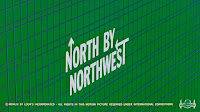
Screen grab of title sequence
Saul Bass was an American graphic designer and Academy Award-winning filmmaker who became known for using the new kinetic typography in his work. An example of this would be from the film, "North by Northwest." Bass showed his first proper use of kinetic type in the opening titles of the film. The type is modern, clean, minimal and the grid shows a reoccurring theme with lots of interetsing lines and points that cross over each other which mimics scenes in the film about people meeting and crossing paths.

Lastly, we looked at conceptual type, there is no clear cut definition for this type but Peter Bil'ak (Slovakian graphic designer) said 'Before the typeface is executed, it is not a typeface, it is simply an idea."

Reference:
Image of "Universal" retrieved from http://www.widewalls.ch/bauhaus-typography/herbert-bayer/

Screengrab from trailer retrieved from https://www.youtube.com/watch?v=KVUnUmPV33c

Thursday, 10 November 2016

Experimental Drawing

The process and production for today was about exploring a sense of place through drawing our surroundings, places like the studio, outside the studio and the area that we work in. I looked at different angles and how to draw from different view points, focusing on detail in some cases. I preferred using oil pastels today rather than pencil or pen, I found them easy to work with and created block colours and shading in some areas to make the drawing as realistic as possible.


Seminar - Referencing

Today's seminar we looked at how to reference properly using APA 6th Referencing. I learnt why we reference things and how to use specific ways of referencing so that all my work is considered my own.

In-text citations can be broken down: summarising & paraphrasing and "quotations"

Directly "quoting" someones exact work and explaining someone elses idea, theory, concept, statistics IN YOUR OWN WORDS is considered summarising or paraphrasing.

Direct quotations can either be small or large quotes. The small quotes tend to be 40 words or less and the larger 40 words or more. Longer quotes have to be indented in the essay so that the viewer knows that this isn't your work.

Examples of how they would be laid out in the reference list at the end of the essay:

Book: Kadolph S., J. (2010). Textiles (11th ed). London: Pearson.
Website : Sustaiable materials. (2015). Textiles. Retrived from http://www.sustainablematerials.org.uk/resources/textiles.html.
Journal : Turney, J. (2014) A sweater to die for: Fair isle and fair play in the killing. Textile: THe Journey of Cloth and Culture, 12(1) 18-33

Introduction to Phase 2

Introduction to Phase 2 of the brief.

I was introduced to phase 2 of the brief, A sense of place {2: place-making}. Using my primary and secondary research from my sketcbook I am thinking of focusing the proposal on one of three choices: distance, wayfinding or crowding in places (specifically looking at how the people and crowds affect the sense of place). I am leaning more towards distance as I feel this is a word that I have focused on more in my sketchbook than any other (or tried too).