Monday, 12 December 2016

Helvetica

Today's lecture and seminar was focussed around Helvetica. We looked at the Helvetica documentary about typography and graphic design. The documentary was released to mark the 50th anniversary of the typefaces creation, it aims to show how Helvetica was created and explores modernism and postmodernism.

We also looked briefly at David Carson, an American graphic designer and art director that is best known for his use of experimental typography. I have researched David Carson before and really love his typography work, I could consider using it as inspiration for future projects.

The seminar was about using existing typography to create a new one, and exploring different shapes and letter forms that create words and new shapes that look interesting and personalised. I really enjoyed this task and I am really happy with the outcome.


Typography created using existing

Thursday, 8 December 2016

Giraffe

Giraffe from Maria Lynam on Vimeo.

Created using Adobe Illustrator and After Effects 

Monday, 5 December 2016

Postmodernism

Order and Chaos - postmodernism and exploring deconstruction
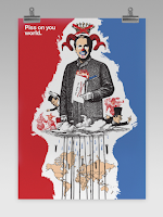
Postmodernism is a general term that applies to art, music and literature it embraces ideas, repetition, challenges the view and asks the viewer to ask questions in and about life.

Christopher Cox / 2008
The poster mixes high and low art together to combine into one image: popular cultural exploration combined with 'proper' art creates a new collaged image that features hand drawn elements and looks highly political. All these features on the poster make it postmodern, it is making the statement that modernism didn't save us which is considered a typical viewpoint of postmodern art.

Jeff Koons / 1988 / 'Michael Jackson and Bubbles'
Koons is an American artist known for working with popular culture subjects, he creates art that is considered poor and is purposefully 'tacky' which is seen to be postmodern. He created this piece of art using popular culture elevated the piece to a 'sculpture' because of its size and its featured in a gallery.


Today we looked at two types of postmodern design: vernacular and self-reference.

Vernacular Design:
  • A style or aesthetic that is associated to a narrative or particular moment, location or group of people
  • Subjectivity and not being limited to one style, allowing subcultural style to emerge
  • Signage, typographical features can all be examples of vernacular design
Self-Reference
  • About looking inward as a designer, thinking about the practice of design and making it apparent in the ACTUAL design itself
Representation and Reality
Jean Baudrillard was a French sociologist, philosopher, theorist and photographer, he wrote the book 'Simulacra and Simulation' which introduces the idea that the principle of the 'real' is interrupted by the changing of signs. It expressed a meaning that is around us and in this situation people become attached by personal events, they can relate to them, they become indifferent and people can't distinguish between appearance and reality. When we are surrounded by digital signs, it becomes overwhelming and we become in a state of apathy.

David Hockney / 1986 / 'Pearblossom Highway'
Hockney has created this image using layers of the same photography to create a new collaged image. He explores the nature of the sign and communicates how the whole page is a sign. The message isn't clear, but chaotic


There are three ways to use the word deconstruction:
  1. A trendy alternative to analysis or interpretation
  2. A visual style in art, architecture, fashion and graphic design
  3. A way of reading text which aims to reveal its internal contradictions
'Deconstruction is not a style or attitude but rather a mode of questioning through and about the technologies, formal devices, social institutions and founding metaphors of representations' - Ellen Lupton

Thursday, 1 December 2016

Physical Typography

Physical Type

Physical Studio

Today's session was about still life drawing and using the objects on each table to draw from. The first table being Physical Type, I chose to focus on the 'R' in the left hand corner to practice my drawing skills from this angle and seeing if I was able to get the right proportion, angle and shading right.

Typography focus with oil paste
Table two was Objects and I took the oppurtinmity to continue to look at typography instead of looking at the object compleyely I took out smaller details. I chose to use oil pastels for the rest of the drawings as I really enjoy working with them and love the marks they produce. I always like to get colour into my work and feel it works best when using oil pastels.


The third table was 'Life's A Box' which were a stack of boxes featuring the IKEA logo (which I took to drawing with the oil pastels again). I found that drawing the boxes was quite hard, getting the right angles and shape of the box was difficult to produce.


Seminar - Essay

Seminar

Looking at the work produced last week we looking at writing the introduction to the essay and how to start it. I have chosen to look at women in gaming as a subculture for my question, I think that by doing something different to the sense of place project will make it more interesting than another focus on Britpop/90's. I am going to take some time gathering research (i.e. Books, Articles, Magazines, Online posts) that is going to help write the essay and begin the introduction. I will be looking at Dick Hebdige and Judith Butler as theorists and explore them further to help with define a gender and also look at gender in the gaming 'world'. By researching this and gathering the right information I should find the essay easier to plan and write the essay.